Customize your course menu and navigation
At a glance
- Shape the menu: hide it entirely for a focused one-page course, or collapse sections into an accordion so a long course stays tidy.
- Help learners find their place: a search box and an optional Exit Course button both live in the course menu.
- Set the order: Locked Navigation keeps learners moving through lessons in sequence instead of jumping ahead.
- Ask for completion: Require Lesson Completion holds the Next button until a learner reaches the end of a lesson and answers its knowledge checks.
- Give a lesson the time it needs: Lesson Pacing sets a minimum time on a lesson so learners take it in instead of skimming past.
- On every plan: all of these are in Theme Settings, they auto-save, and none of them are gated behind a paid tier.
Every Slate course opens with a sensible default: a menu on the left listing your sections and lessons, search switched on, and learners free to move wherever they like. That works for most courses. But the menu and the way learners move through it are both yours to reshape, whether you want to strip everything back to a single focused page or build a deliberately sequential course that learners take one step at a time.
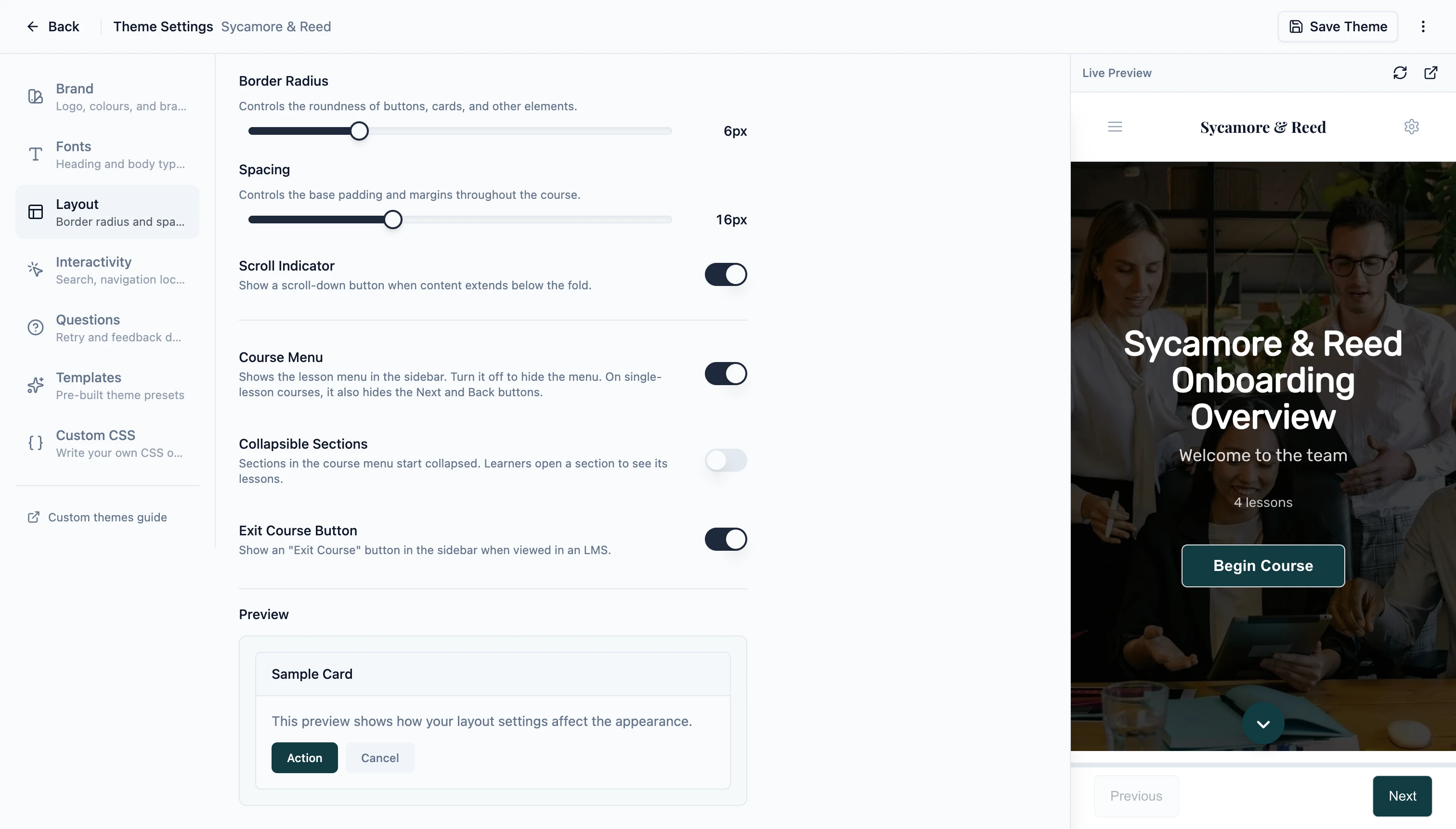
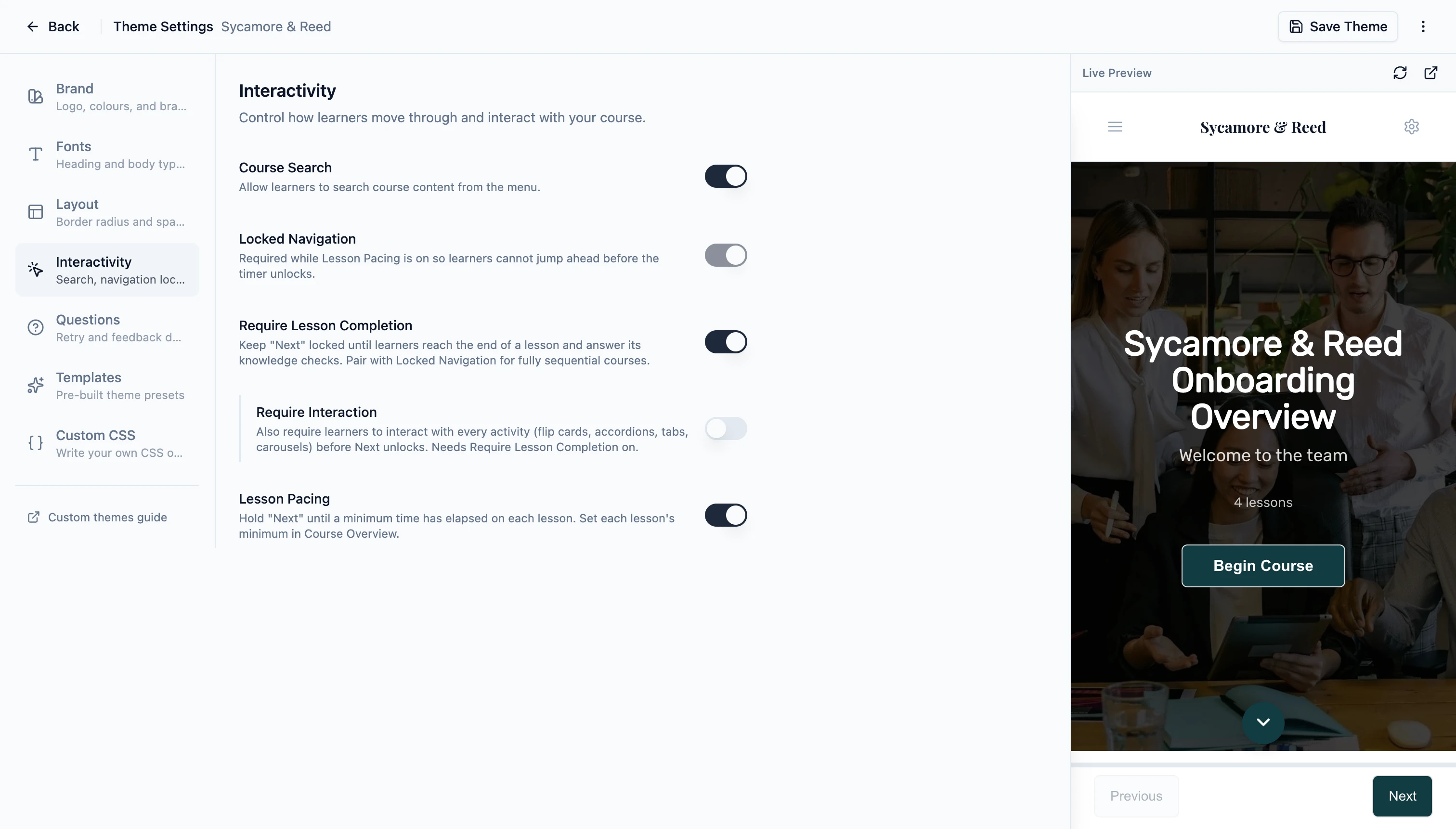
All of the controls in this post live in Theme Settings, under its Layout and Interactivity sections. Changes auto-save as you make them, they carry into any theme preset you save, and they stay in place when you duplicate or import a course. None of them are gated behind a paid tier: everything here works on Free, Standard, and Pro. You can read the full reference in the Theme Settings docs.
Shape the menu
The first set of choices is about the menu itself: whether it shows at all, how it organizes a long course, and what sits inside it.
Hide the menu
The Course Menu toggle in the Layout section controls whether the sidebar menu appears. Turn it off and the menu is gone, which suits a short, linear course where the lesson list would only be a distraction, or a course you are embedding inside another tool. On a single-lesson course, hiding the menu also removes the Next and Back buttons, leaving a clean one-page experience. Remove the title page as well, so there is genuinely just the one page. On a multi-lesson course those buttons stay put, so learners can still move forward even without the menu.
One thing worth knowing: a few other features in this post live inside the menu, so they switch off with it. Collapsible Sections, the Exit Course button, search, and Locked Navigation all need the Course Menu on to do anything.
Group lessons into accordion sections
On a long course, a flat list of every lesson gets unwieldy. Collapsible Sections (also in the Layout section) starts each section closed, so the menu opens as a short list of section titles. Learners click a section to reveal its lessons, and the section they are currently in expands on its own so they always see where they are. It keeps a twenty-five-lesson course readable at a glance instead of asking learners to scroll through a long menu.
Add an Exit Course button
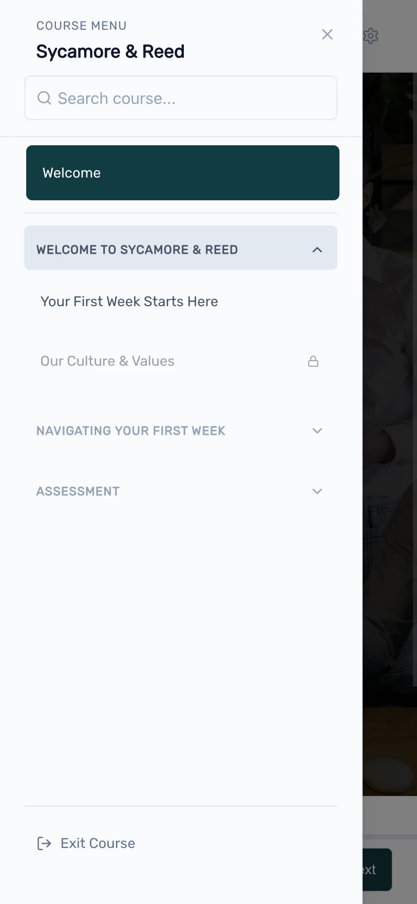
The Exit Course Button toggle, again in Layout, adds an "Exit Course" button to the bottom of the menu, like the one in the menu screenshot. It appears when the course is launched inside an LMS. When a learner clicks it, their progress is saved, the session is closed cleanly, and the tab closes. If the LMS opened the course in the same tab, so there is nothing to close, learners see a confirmation message instead. It gives learners a clear, deliberate way to leave rather than reaching for the browser's close button.
Let learners search
Course Search puts a search box at the top of the menu, shown in the menu screenshot, so learners can jump straight to a lesson by typing part of its title instead of scrolling. It is on by default, and you will find its toggle in the Interactivity section rather than Layout (it is a navigation control, so it sits with the others). Search respects whatever order rules you have set: if a learner has not reached a lesson yet and you have locked the order, that lesson stays out of the results.
Guide how learners move
The second set of choices is about pace and order. By default learners roam freely, which is right for reference material and optional content. When the order matters, or when you want learners to spend time on a lesson before moving on, the Interactivity section has three controls for it.
Lock the order
Locked Navigation asks learners to work through lessons in sequence. They cannot jump ahead in the menu to a lesson they have not reached yet; lessons further along show a padlock until the path to them is clear. The Next button is always a safety net here, so a learner moving forward one lesson at a time is never blocked. Only the out-of-order jumps through the menu are held back. It is the right call when later lessons assume the earlier ones, or when an assessment at the end should only open once the content has been seen.
Require completion before moving on
Require Lesson Completion keeps the Next button locked until a learner has actually finished a lesson: reached the end of its content and answered any knowledge checks on the page. If questions are still open, Slate flags those first; once they are answered, it prompts the learner to scroll to the end. It is a gentle way to make sure the content is seen rather than clicked past, and it pairs naturally with Locked Navigation for a fully sequential course.
There is an optional extension, Require Interaction, that goes a step further: it asks learners to engage with every interactive activity on the page too, such as flipping each flip card or opening each accordion panel, before Next unlocks.
Give a lesson the time it needs
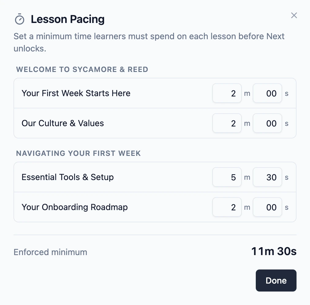
Some lessons deserve more than a quick scroll. Lesson Pacing sets a minimum amount of time on a lesson before the Next button unlocks, so learners spend a moment with the material instead of racing past it. It is a small nudge toward attention: the kind of pause that helps a key idea actually stick.
Turn on Lesson Pacing in the Interactivity section, then set the minutes and seconds for each lesson from the Course Overview page. You can give every lesson its own minimum or leave the lighter ones unpaced. In the player, the Next button shows a live countdown, like "Available in 1:41", until the time is up. The clock only runs while the lesson is open and on screen, so a learner cannot leave it ticking in a background tab. Because pacing only makes sense in order, turning it on also locks navigation so learners finish the current lesson before skipping ahead. You can read more in the Lesson Pacing docs.
Mix and match
These controls are meant to combine. A reference library might hide the menu's order rules entirely and lean on search. A structured onboarding course might collapse its sections, lock the order, and require completion so learners move through it as intended. A short, high-stakes lesson might add pacing on top so the important parts are not skimmed past. Start from the default, change only what your course actually needs, and let the rest stay open.
It all lives in Theme Settings, it all auto-saves, and you can save a setup you like as a theme preset to reuse on your next course. If you are still deciding which plan fits, every control here is available on all of them: see pricing for the details.